串聯親子共融空間,打造育兒友善新城市
我的角色
UI/UX Designer
團隊組成
UI/UX 設計X1 前端工程師X1 PM X 1 後端工程師 X 1
專案時間
三週

訪談題目一:你上一次預約親子館/兒童設施是怎麼操作的?(記憶提取題)
想請你回想最近一次要帶小孩去親子館或兒童樂園的情況,你是怎麼預約的?是打電話、現場排隊,還是用其他方式?那時有遇到什麼困擾或卡關的地方嗎?
設計意圖:
喚起實際使用情境,挖掘目前預約流程的行為痛點與具體情境(如:時間限制、排隊壓力、家人協調等)
收集使用者的語言描述,作為日後介面資訊設計素材
訪談題目二:你覺得一個「好用的預約網站」應該長什麼樣子?(心理帳戶題)
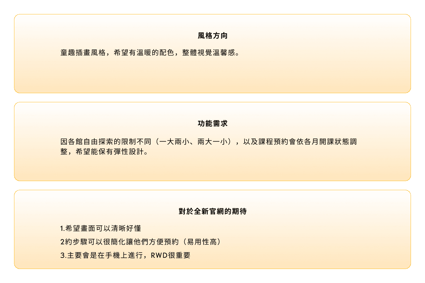
如果要設計一個讓你覺得「好用、值得用」的預約網站,你覺得它最重要要做到什麼?舉個例子來說也可以,像你之前用過覺得不錯的網站是哪一種?
設計意圖:
探索家長在「易用性」與「價值感」上的標準,例如:快速完成、畫面清楚、彈性選擇等
對齊設計優先順序與使用者心中「值得使用」的門檻
訪談題目三:通常你是在什麼時候、什麼狀況下會決定帶小孩去這些設施?(關聯行為題)
你平常會在什麼情況下安排帶孩子去親子館或樂園?是週末、天氣好,還是看到什麼資訊才決定的?你通常會跟誰一起討論或安排?
設計意圖:
探索使用平台的決策觸發點與使用環境(如:臨時 vs. 提前、自己 vs. 配偶安排)
了解預約平台在生活情境中的角色與關聯活動(如天氣、家人時間協調、節日活動)
Stage 4. User Testing & Iterations
Organized a series of remote user testing sessions, employing both qualitative and quantitative methods to evaluate the app's usability and effectiveness in fostering collaborative learning. Analyzed feedback to identify patterns and areas for improvement, leading to several design iterations that enhanced user engagement and satisfaction.
Stage 5. Final Presentation and Documentation
Prepared an in-depth presentation and comprehensive documentation detailing the research findings, design rationale, user testing outcomes, and the iterative design process. Highlighted the app's potential to transform the educational landscape by making learning more interactive, engaging, and collaborative.
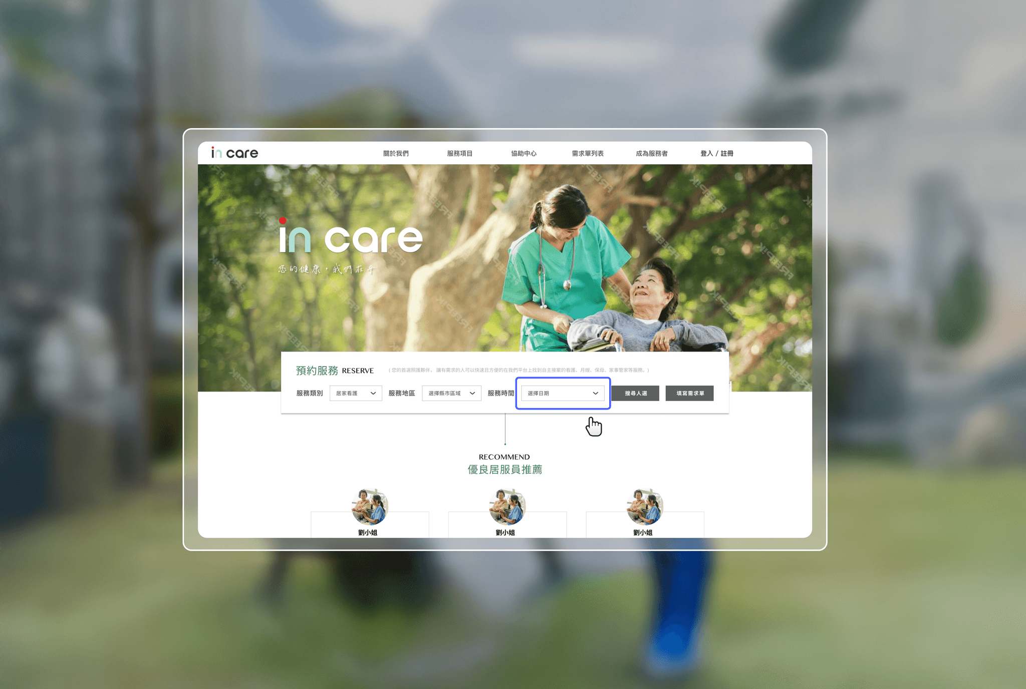
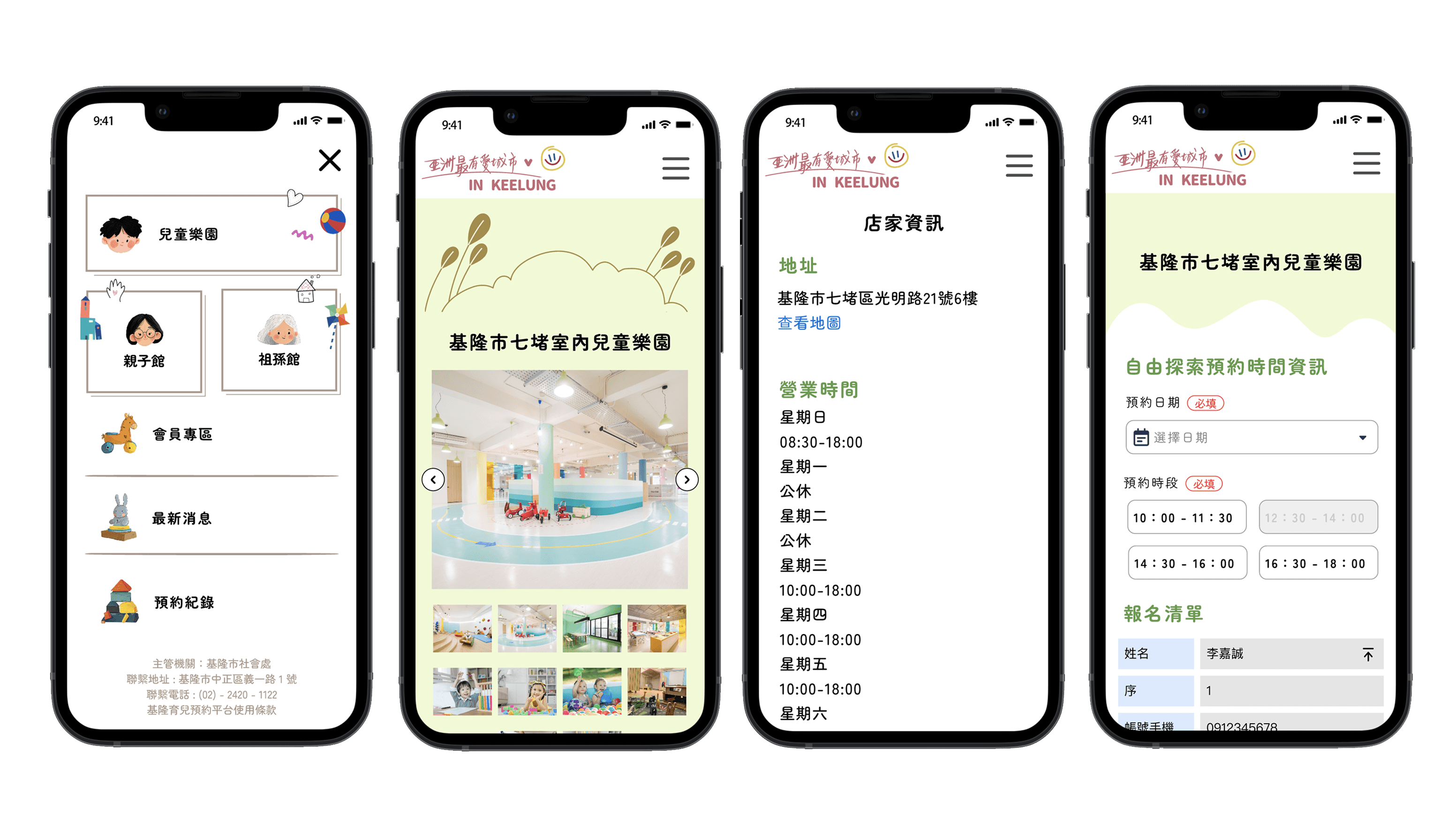
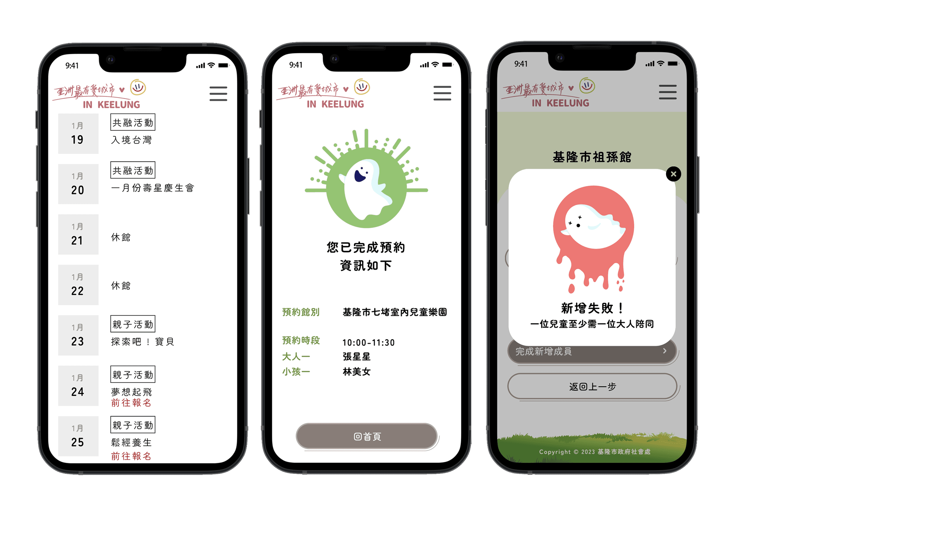
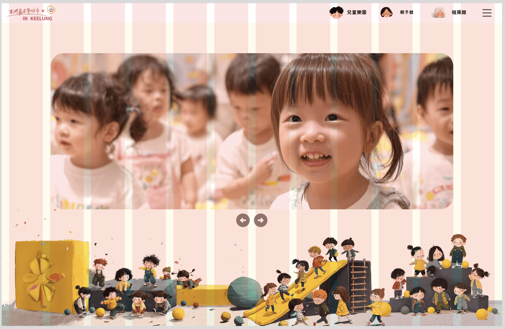
設計成果
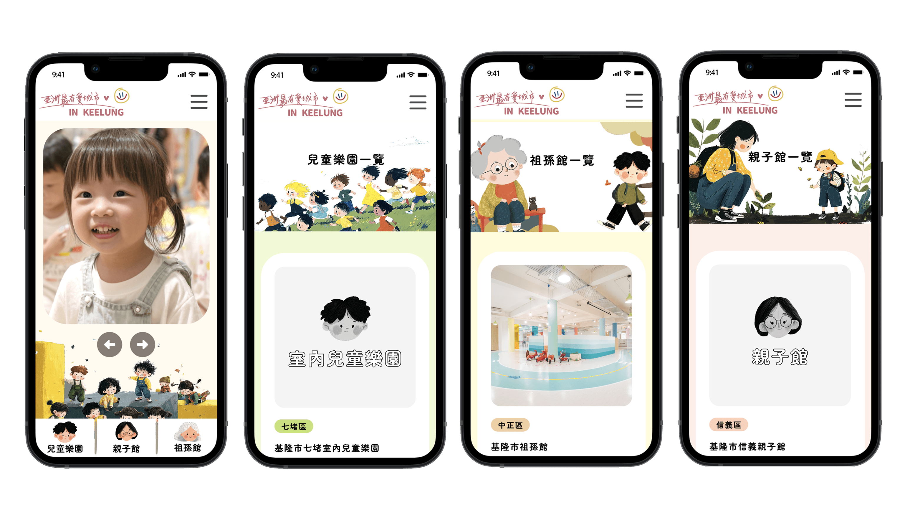
桌機首頁呈現

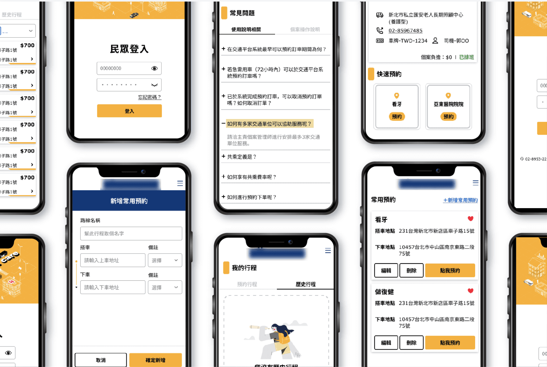
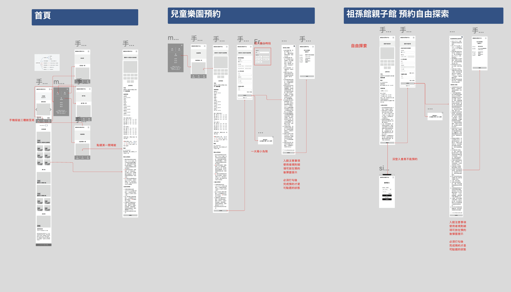
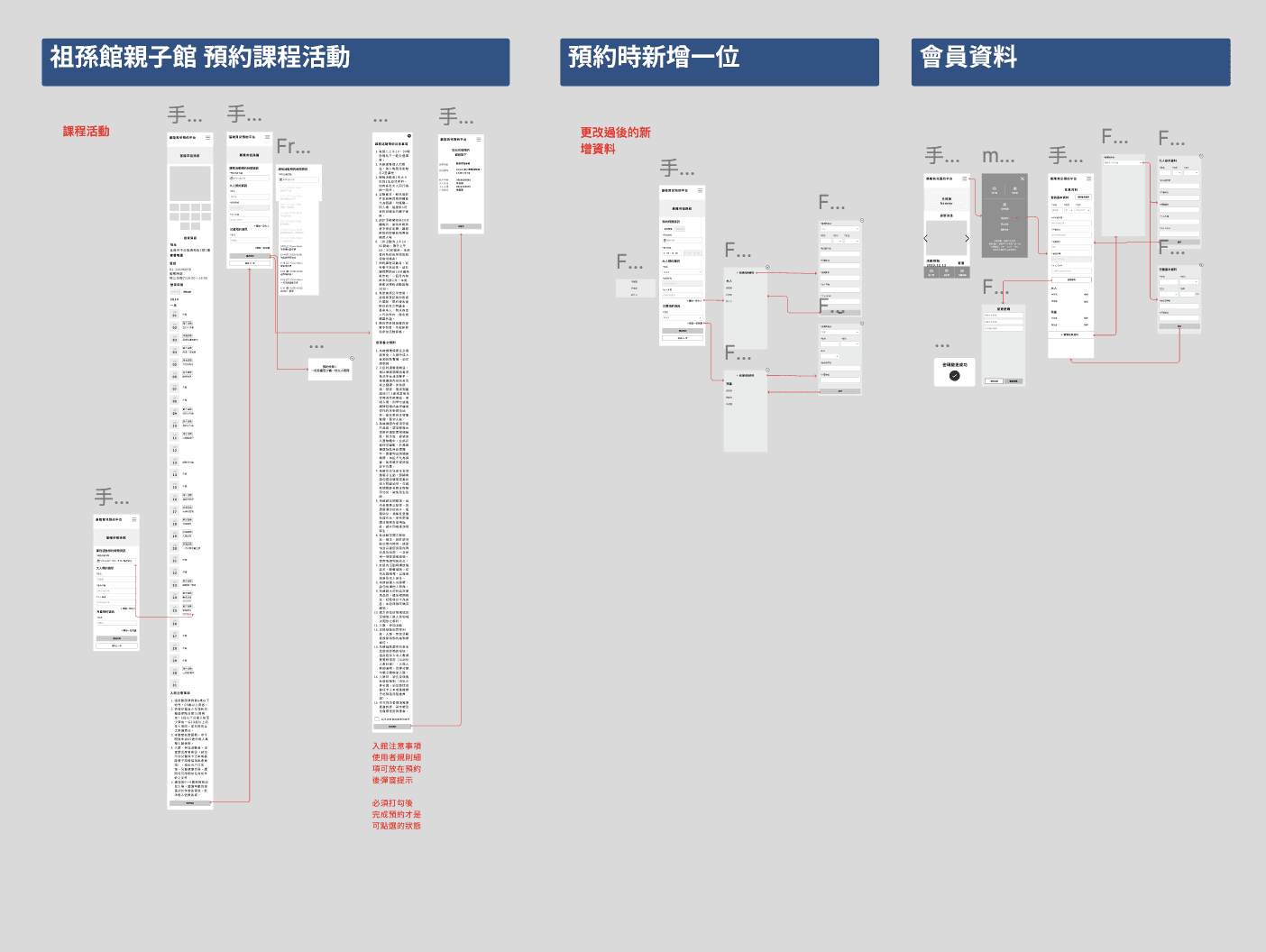
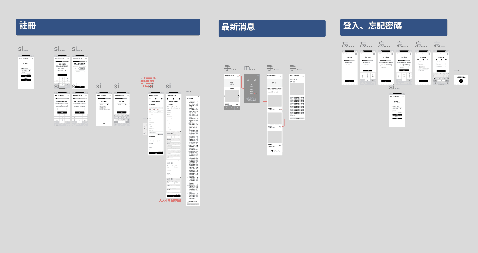
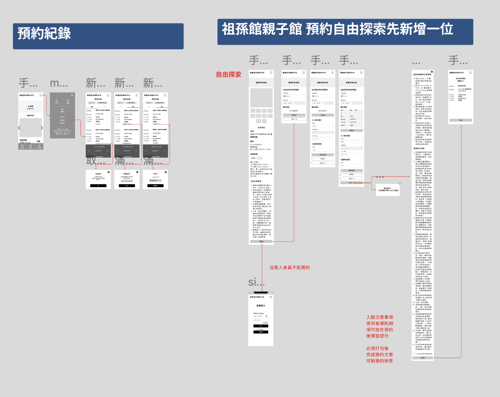
預約流程

預約失敗提醒

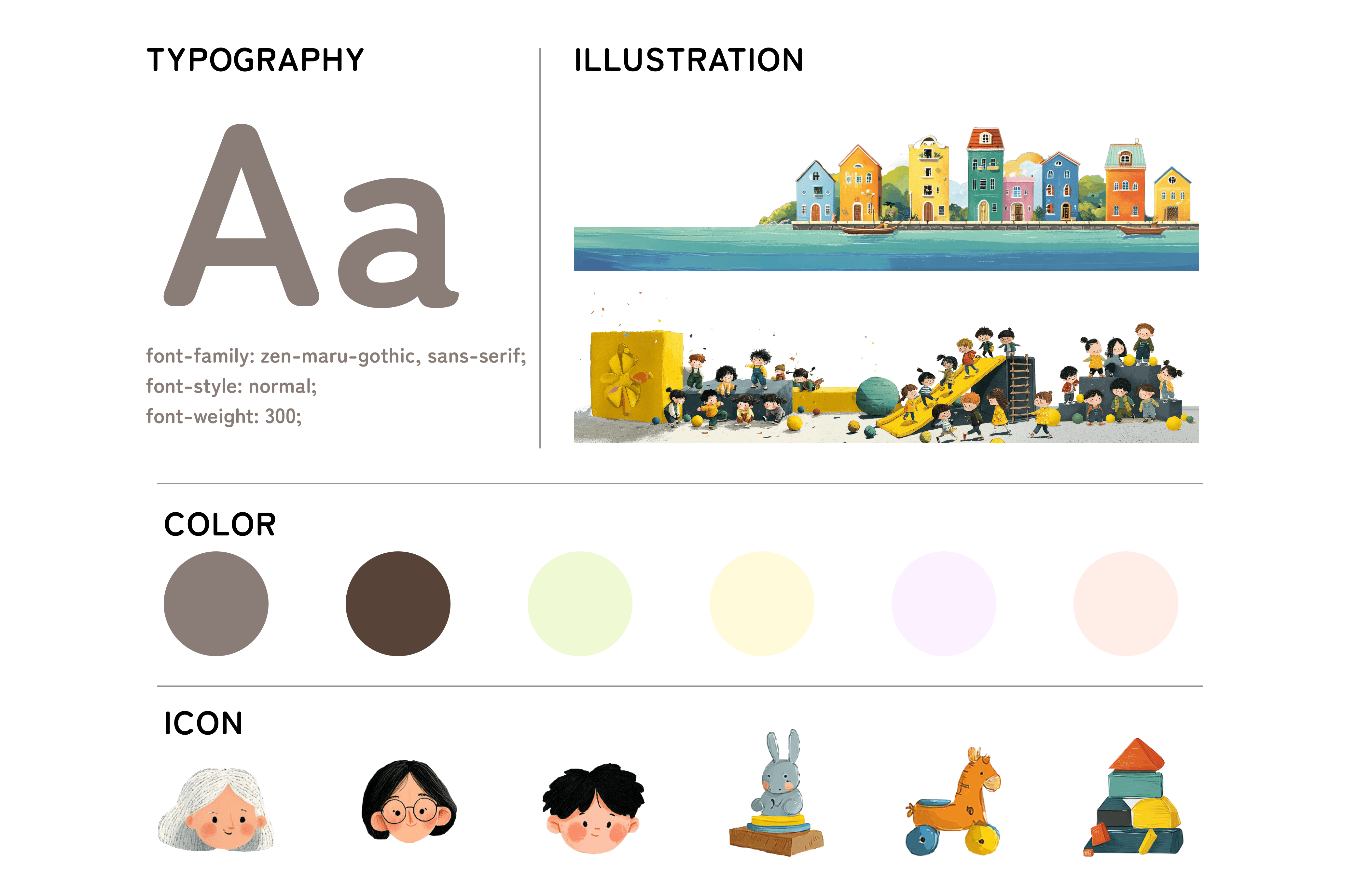
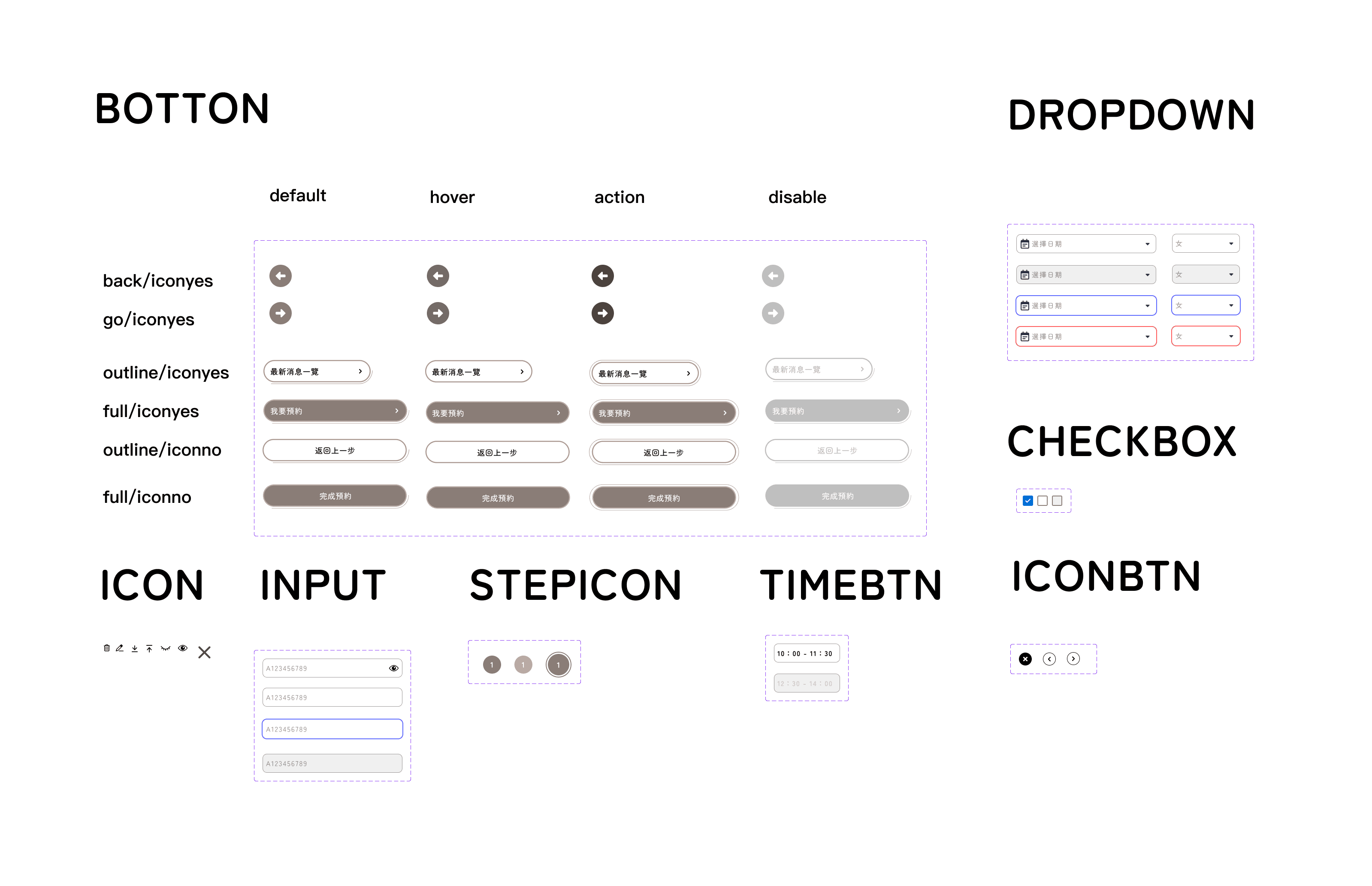
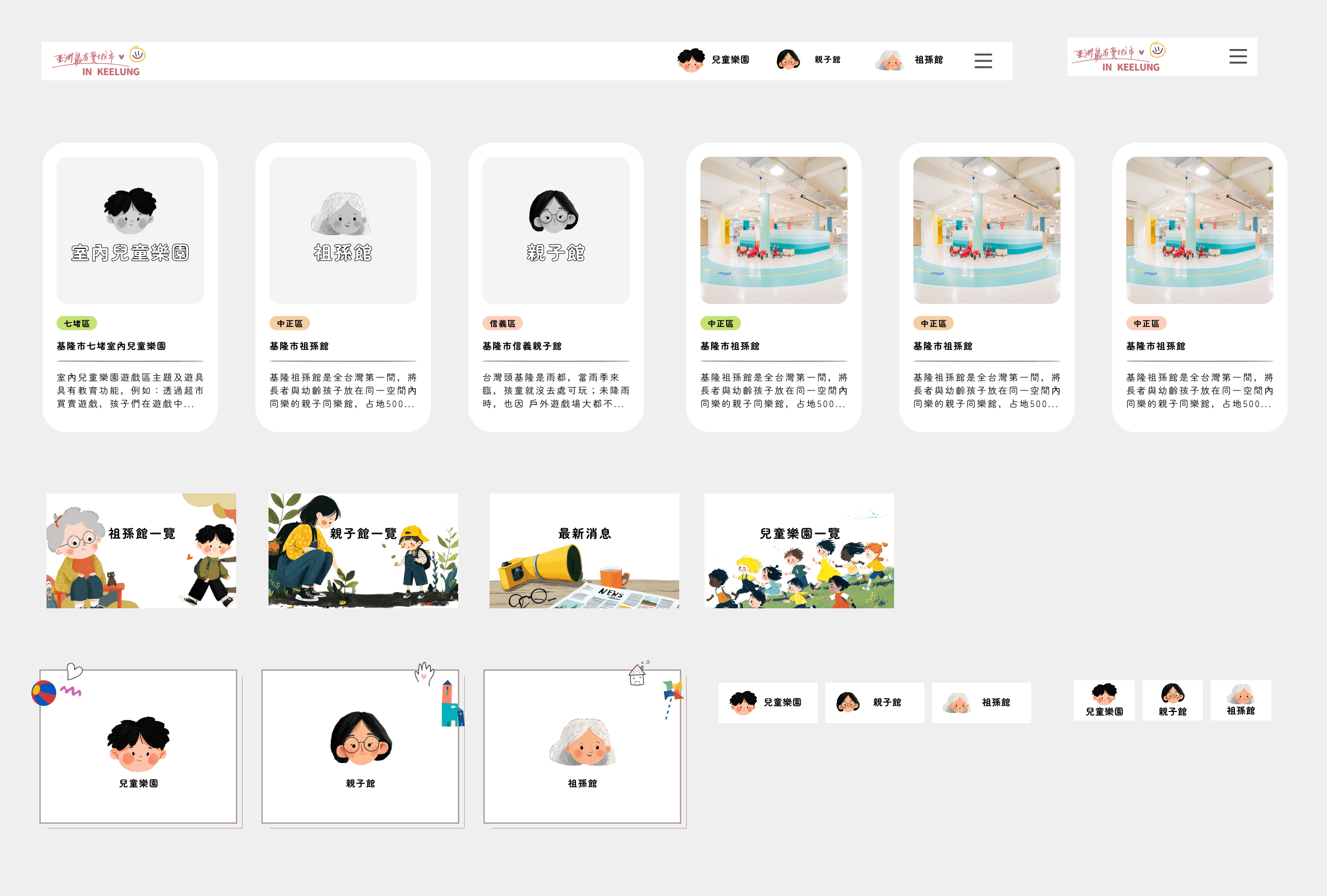
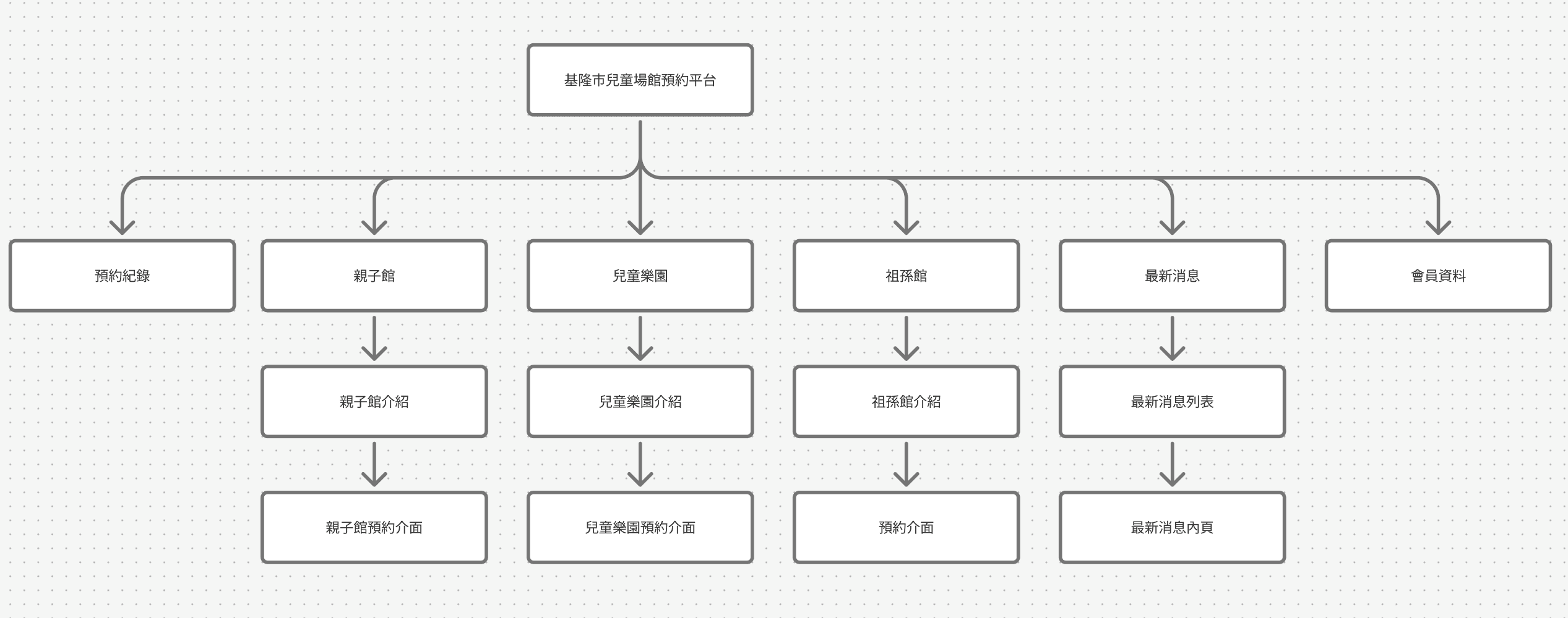
從資訊架構到預約流程皆由我主導規劃,有效提升 PM 與客戶溝通效率;視覺上加入童趣插畫元素,賦予平台溫暖、友善的育兒氛圍,強化使用者情感連結。